compensation statements
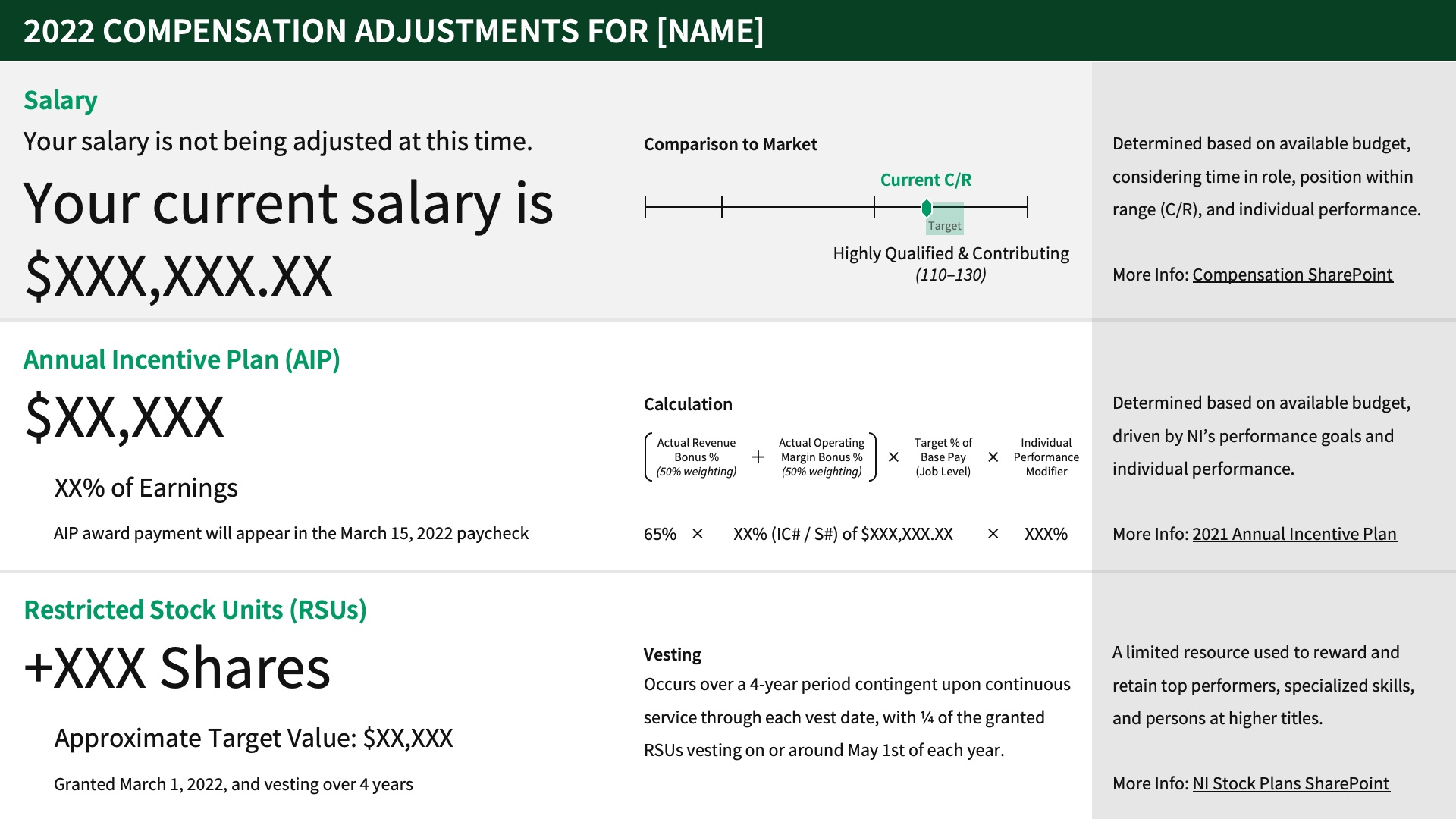
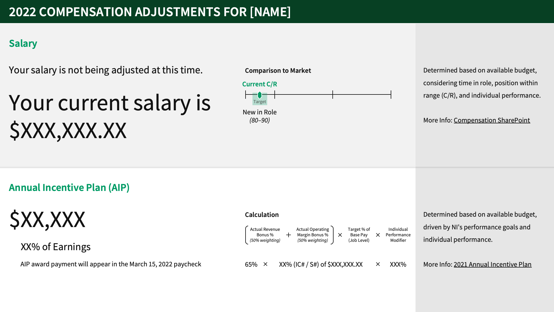
sharing raises, bonuses, and stock awards is one of the best parts of being a manager. however, the tools and default reports they generate aren't always great. take for example, this default statement for someone whose salary isn't being adjusted during the typical compensation planning cycle:
“congratulations, you're not getting a raise!” yikes.
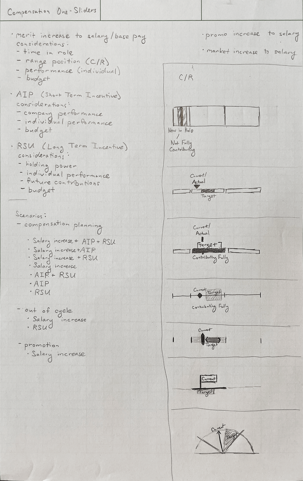
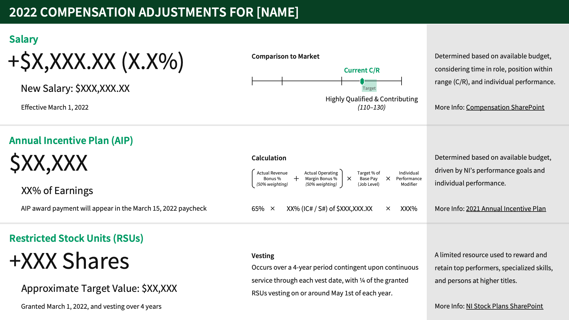
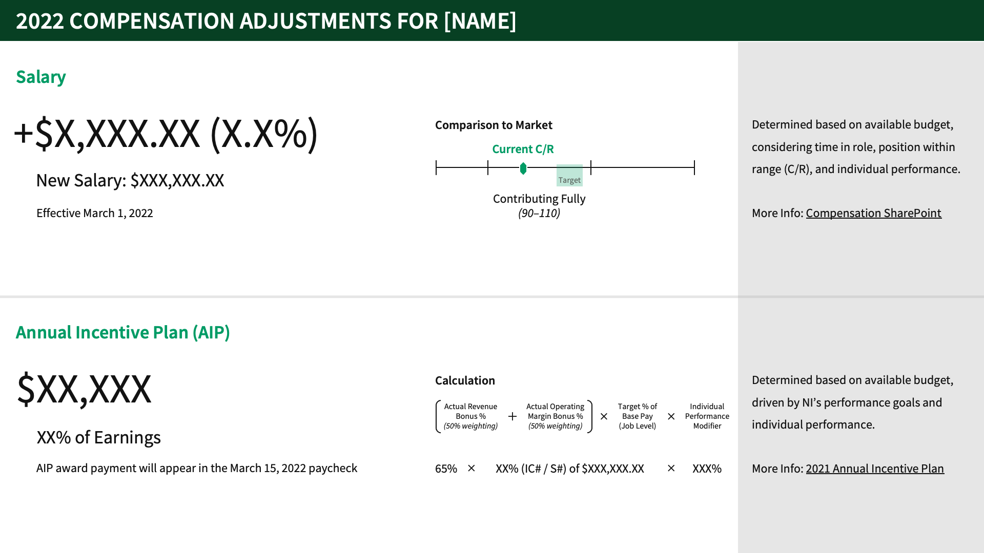
i spent an evening exploring different options for improving this document while also including all the other compensation elements into a one-pager:
here's the final template that managers across the org used:
r&d internal conference accessibility presentation
i'm still expanding my knowledge of accessibility in design and development, but i'm a passionate advocate in this space.
a development colleague (and fellow accessibility advocate) from the recently-founded design system team and i collaborated on a “practical accessibility” presentation for our internal technology conference. the goals were to expand the org's knowledge of accessibility, and to share how the design system could help designers and developers with good defaults as a starting point.
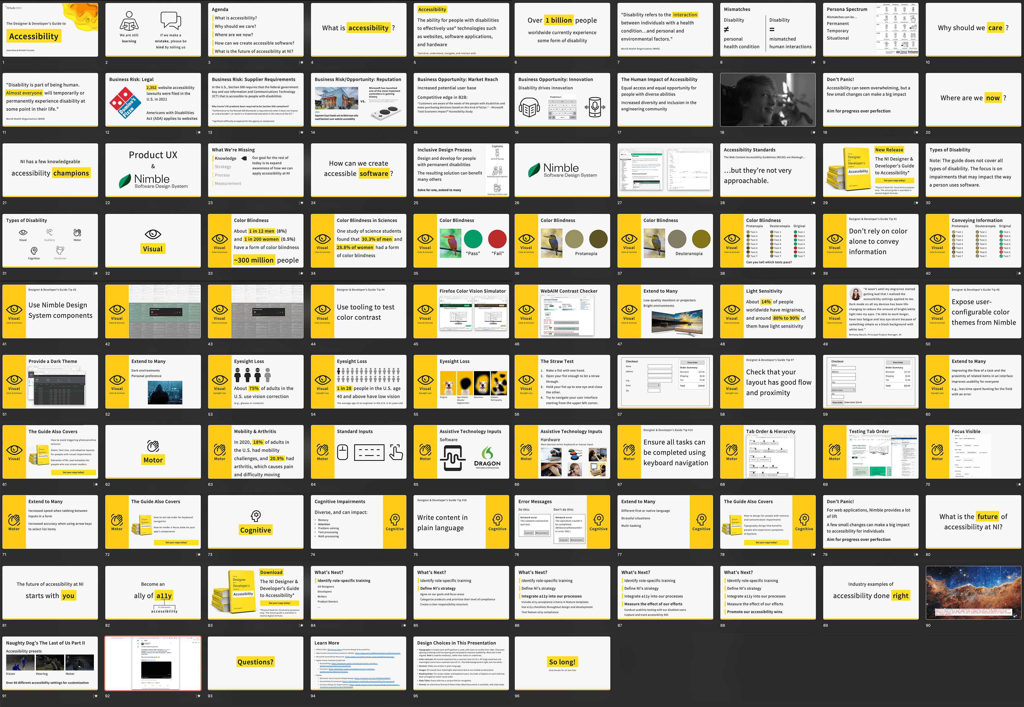
here's an edited version of my sections of the presentation:
and here are some design choices in the presentation slides:
- typography: a simple sans-serif typeface is used, with sizes no smaller than 18px. character spacing (tracking) and line spacing are increased to improve readability. most text is left-aligned. bold is used for emphasis, rather than italics or underlines.
- color contrast: all normal-sized text has a contrast ratio of 4.5:1. all large-sized text and meaningful icons have a contrast ratio of 3:1. the slide background is light, but not white.
- content: slides are written in plain language.
- images: all visuals have meaningful alternative text or are marked as decorative.
- reading order: for screen reader and keyboard users, the order of objects on each slide has been arranged to match visual order.
- slide titles: every slide has a unique title for navigation.
- format: an alternative format of these slides (word document) is available, with slide notes.
design system
prior to my involvement, there were several individuals passionately advocating for an ni design system. my role in the project largely involved…
- bringing together individuals across design, development, product ownership, management, and other disciplines.
- focusing their efforts on a common goal.
- creating opportunities for them to communicate successes and needs to senior leadership.
i began this endeavor by designing and facilitating a workshop. the goals were to discover everyones’ hopes and fears about the design system work, to define what success might look like, and to leave with concrete actions for each role.
next, i set up a recurring shareback with leadership stakeholders across departments. the primary goal of this was to get leadership buy in and support to move this from a grassroots effort to a fully-staffed and funded team. every two months, i facilitated content creation for this shareback. after the first couple times, i created a template with the common content sections:
- progress & upcoming work
- successes
- challenges (especially those needing leadership's input)
- special topics (things like staffing and long-term governance models)
- and a summary of key takeaways.
occasionally, i would present during these sharebacks, but my preference was always to enable individuals to present their own work and to get direct face time with leadership.
the result? within half a year, the design system became an officially staffed team. they continue to make exceptional progress on the nimble design system, which is now open source.
team t-shirt illustration
i had a ton of fun creating the illustration for our latest team t-shirts. you can read about the full collaborative process on my dribbble post.
![a document that says the following:
Change of Compensation
Dear [redacted]
Congratulations! As a result of your contributions,
[redacted] is pleased to award you with a
compensation increase.
Effective [date redacted], your new annual target commission will be USD .00. This represents a .0% adjustment to your current target commission of USD .00.
Your new compensation award will be paid in accordance with the regular payroll cycle for your location and your pay increase will appear on the next scheduled pay date (provided you remain an active employee on the effective date).
Your ongoing commitment to drive [redacted]'s success is greatly appreciated and we are committed to support you in your career here at [redacted].
If you have any questions or would like to learn more about this salary change or compensation in general, please let me know.
Congratulations again.](assets_oddsandends/compredesign/ogcompstatemedredacted.png)
