running short on time? check out this overview video—it's under 2 minutes ☝️
user goal: develop code in collaboration with colleagues using modern software development best practices and tooling.
the problem: labview nxg didn't have the ability to compare different versions of a project and merge changes, which is necessary for collaboration using modern software development tools such as git source code control.
the team:
me (interaction designer)
visual designer
product owner
technical lead
developers (5)
note:
i needed to simultaneously balance the design needs of three development squads with different focus areas.
background
prior work
one of the first projects i worked on at ni was graphical code diff (a.k.a.,compare).
in the course of that project, i conducted user and stakeholder interviews, as well as a competitive analysis, so i had existing domain knowledge.
new team(s)
in 2018, i joined three different development teams, including the labview nxg collaborative development team. our mission: help labview nxg users develop collaboratively by integrating industry-standard development tools and best practices.
around the same time, i read the book lean ux: applying lean principles to improve user experience that resonated with challenges the design team faced. with my manager's blessing and development team's buy-in, i decided to experiment with this more agile process.
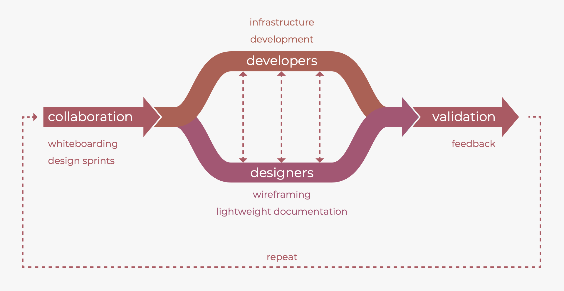
lean ux process
one key aspect of lean ux is to focus the team on a specific problem. the product owner and i conducted interviews and secondary research to narrow the focus to this problem:
labview nxg developers working in a team environment find it difficult to know which files in a project have been modified by others. how might we enable development teams to know what has changed between versions of a project?
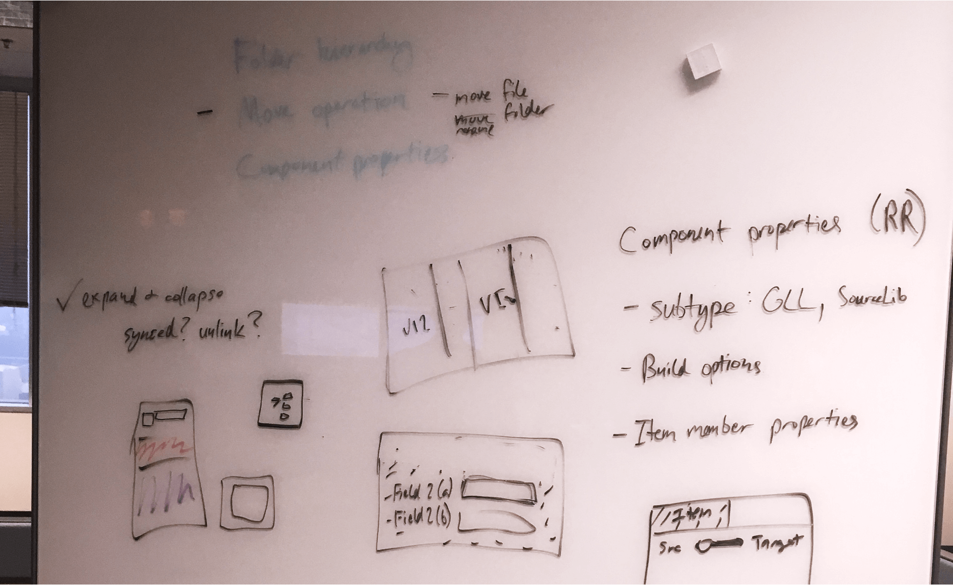
collaborative whiteboarding kickoff
to build shared understanding of the problem space, i facilitated a whiteboarding session with the entire team. in advance, i put together a list of existing solutions on the market to walk through as a lightweight competitive analysis:
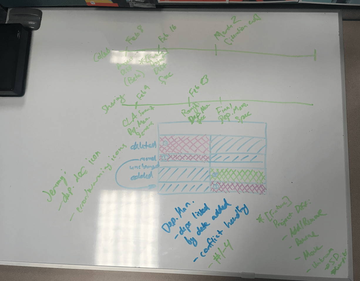
as both facilitator and participant in the whiteboarding session, i ensured everyone wrote their own ideas on the whiteboard.
we left this first session with a shared understanding of the problem and general design direction.
at this point, i could spend time exploring and fleshing out the design, and the developers could get started building the necessary backend infrastructure.
externalizing work
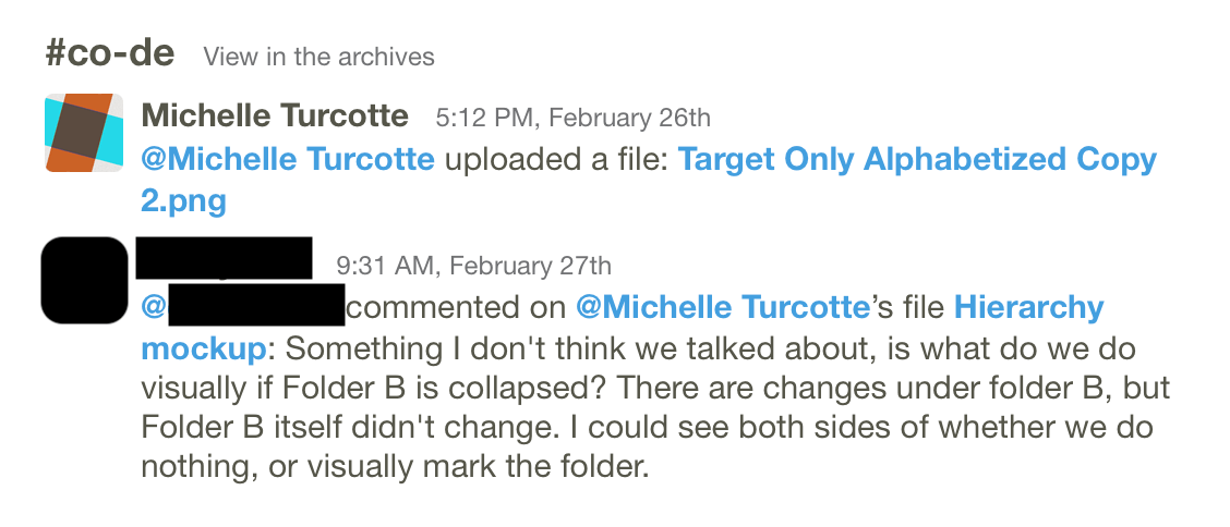
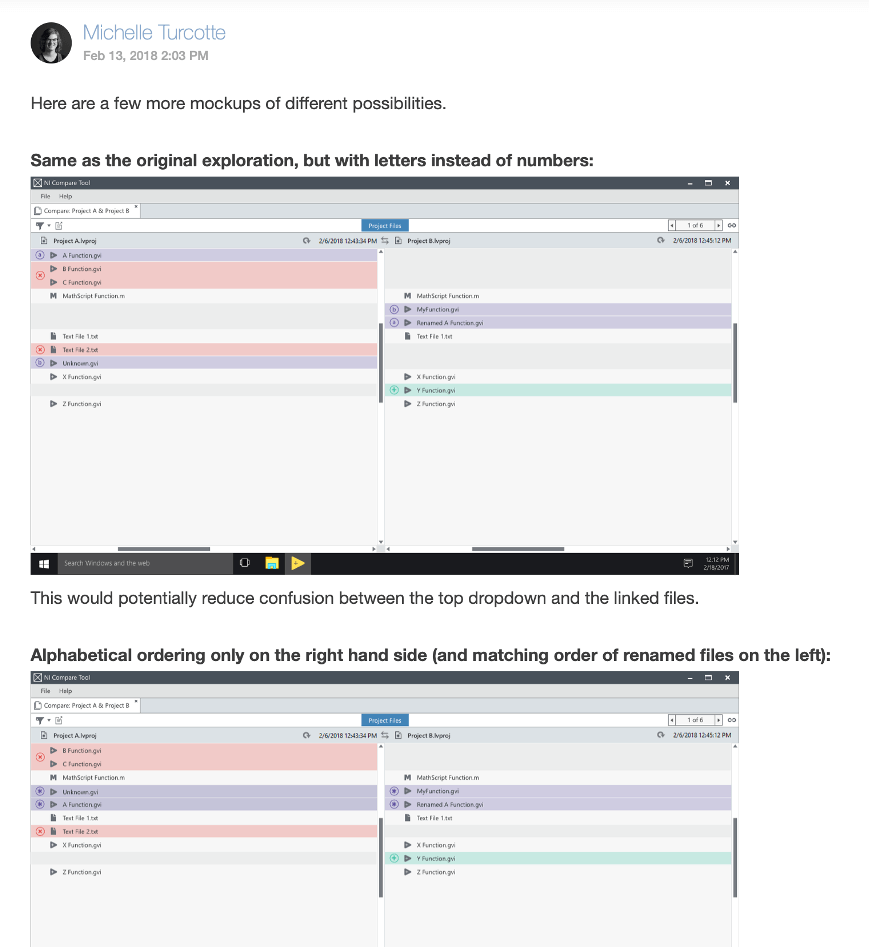
i made my design explorations and progress visible for feedback by having a whiteboard and sticky notes at my desk. i also regularly posted new mockups and smaller questions to our slack channel for discussion.
the developers posted progress and ux questions on slack. additionally, we had a weekly “demo day” for me and others to provide feedback on work.
lightweight documentation
close collaboration removed the need for a heavy design spec. only key decisions and larger conversations needed lightweight documentation.
in-product results & continuous discovery
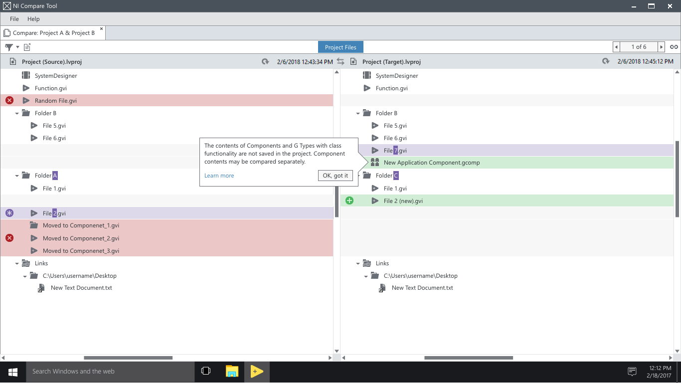
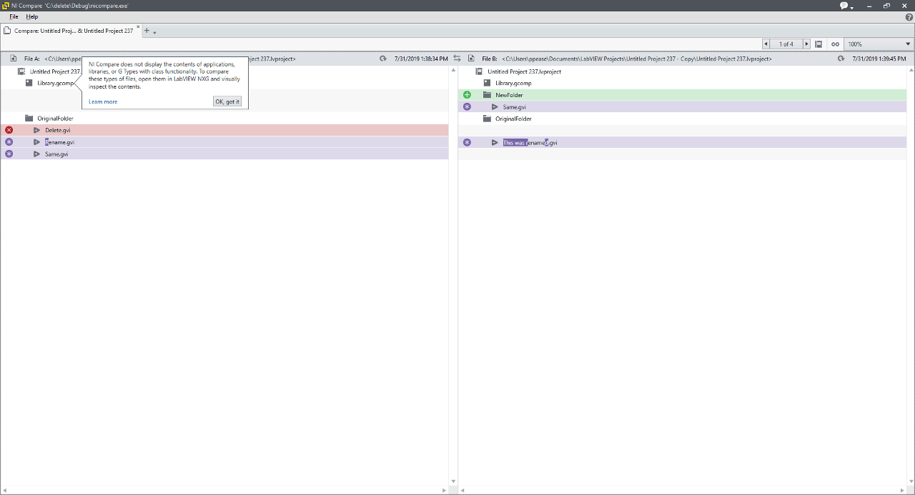
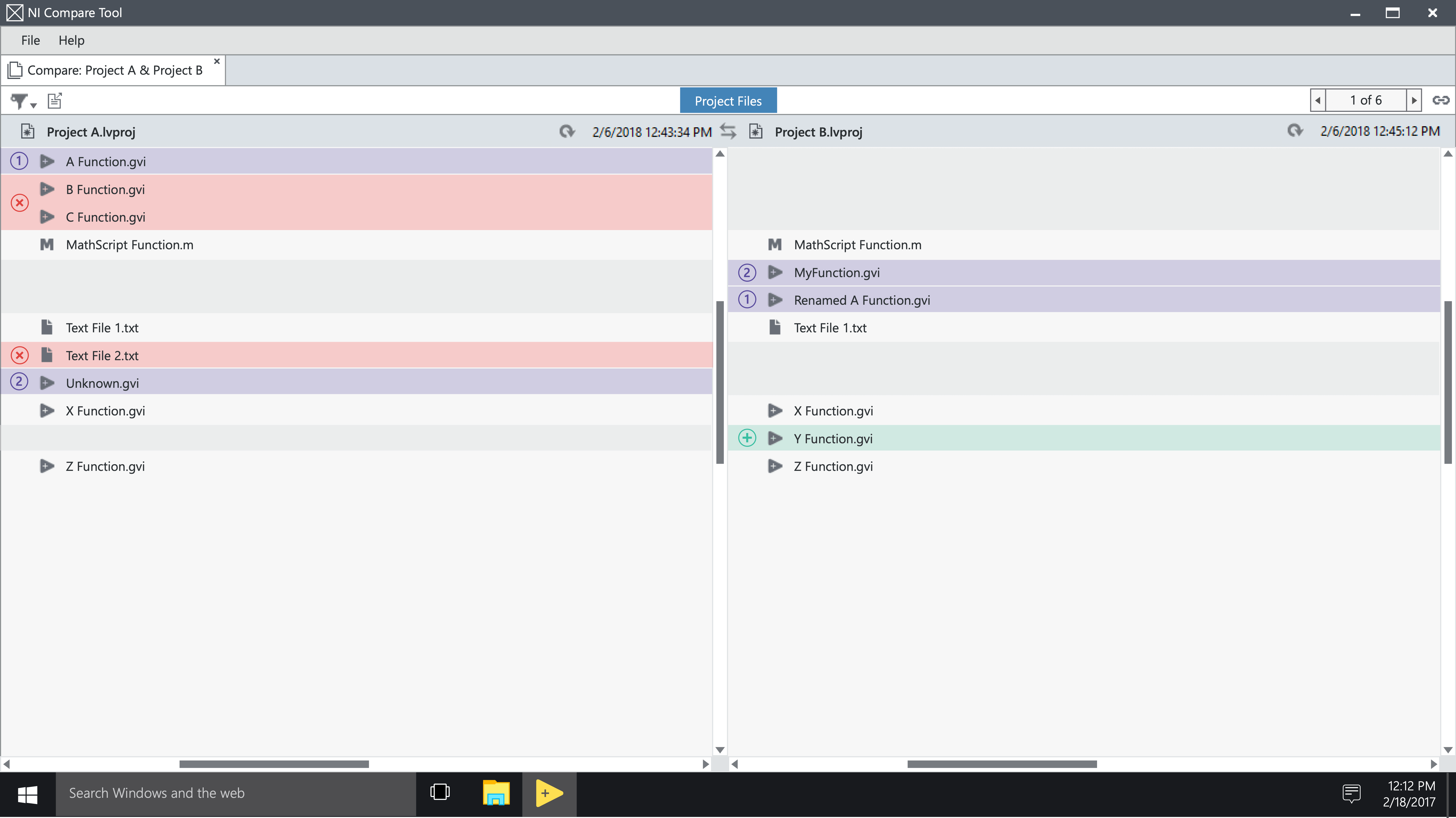
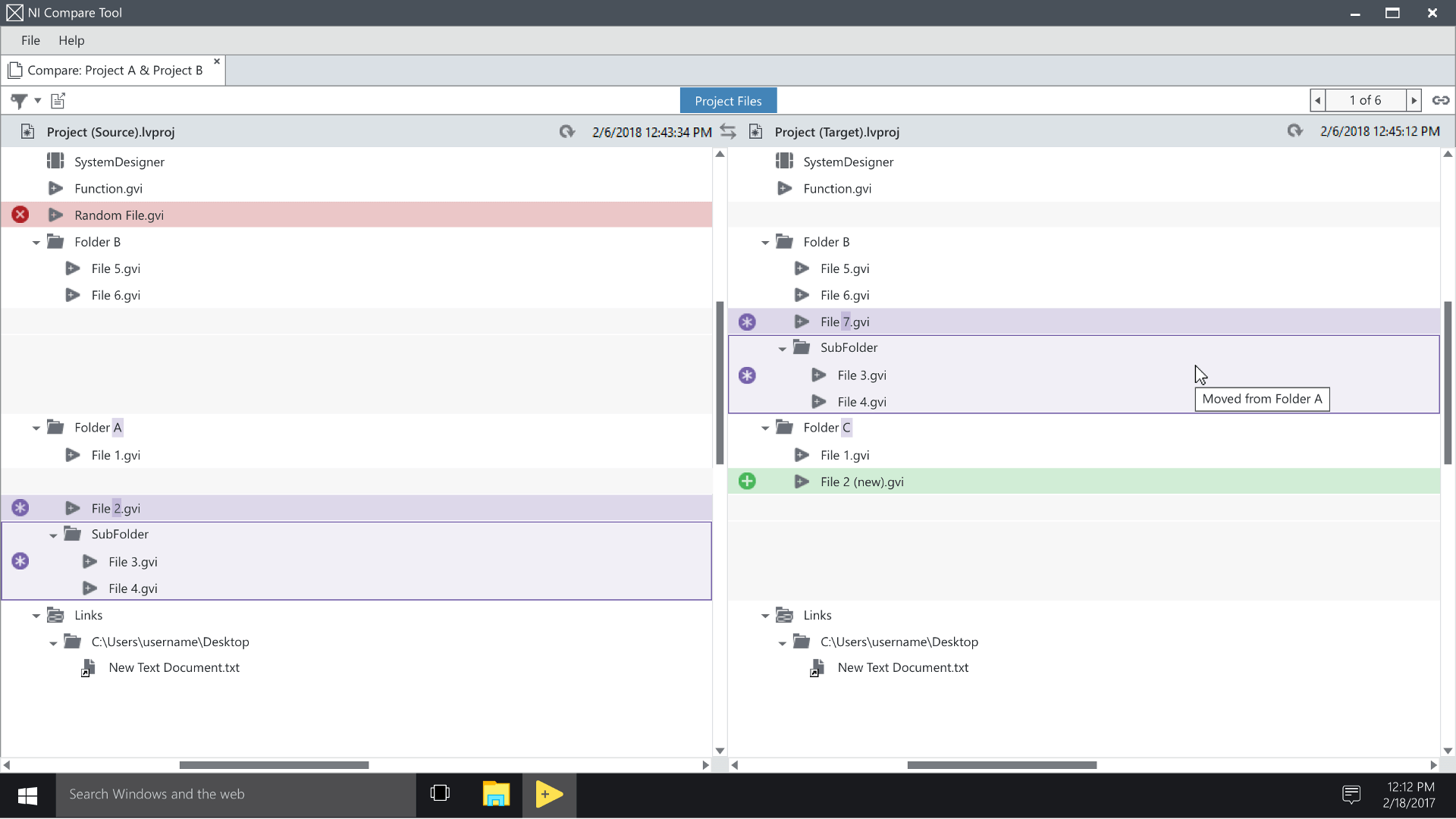
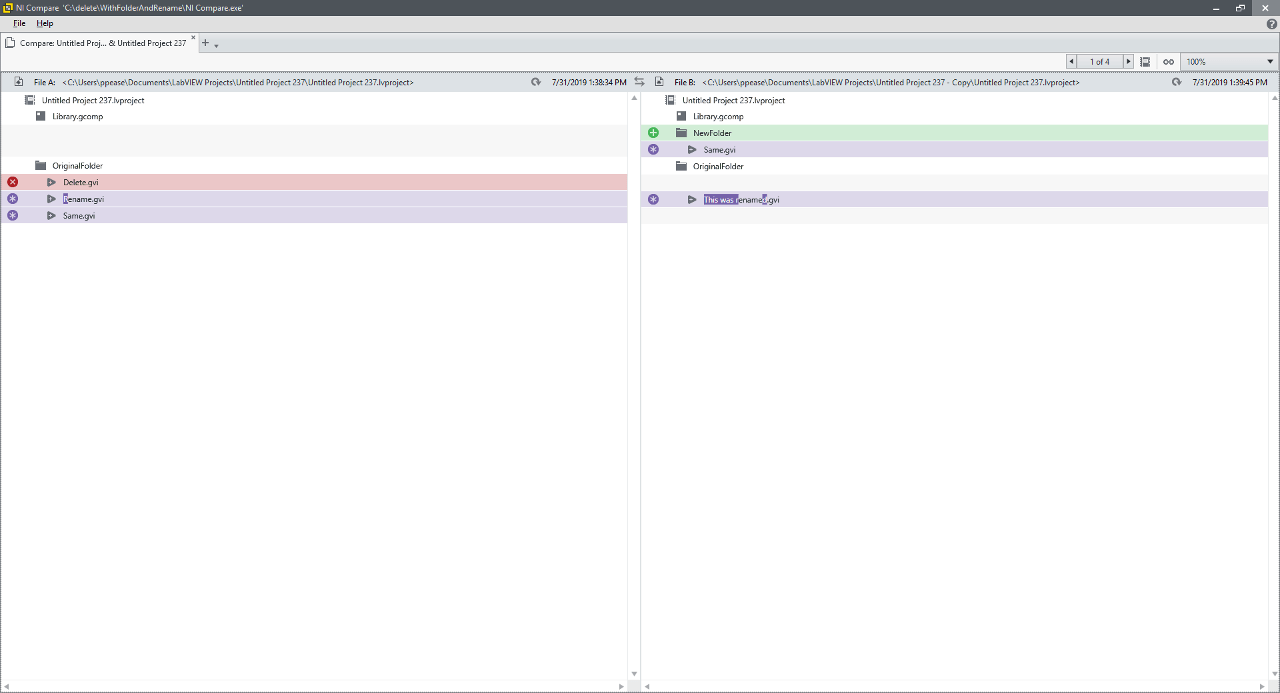
for the first development iteration, we decided to not show folder hierarchy for simplicity and development schedules.
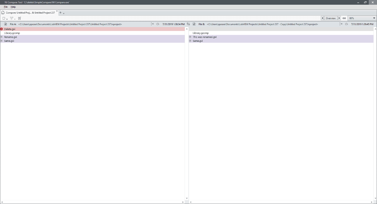
this initial working version in product enabled us to get feedback from internal users and stakeholders.
multiple rounds of collaboration
folder hierarchy
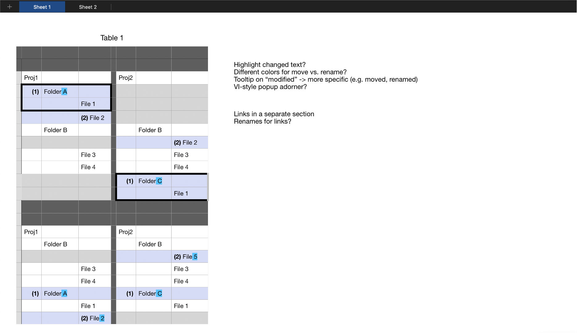
to move beyond just a flat list of files, we needed to define our strategy for displaying folder changes. so the tech lead, one developer, and myself got in front of a whiteboard.
however, we quickly discovered that this problem was too complex to simply draw on a whiteboard. instead, we found a spreadsheet tool allowed us to quickly move content and explore visualization options.
once we had a direction, i was once again able to spend time creating high-fidelity mockups and designing micro-interactions while development made progress.
as before, the resulting product allowed us to get feedback.
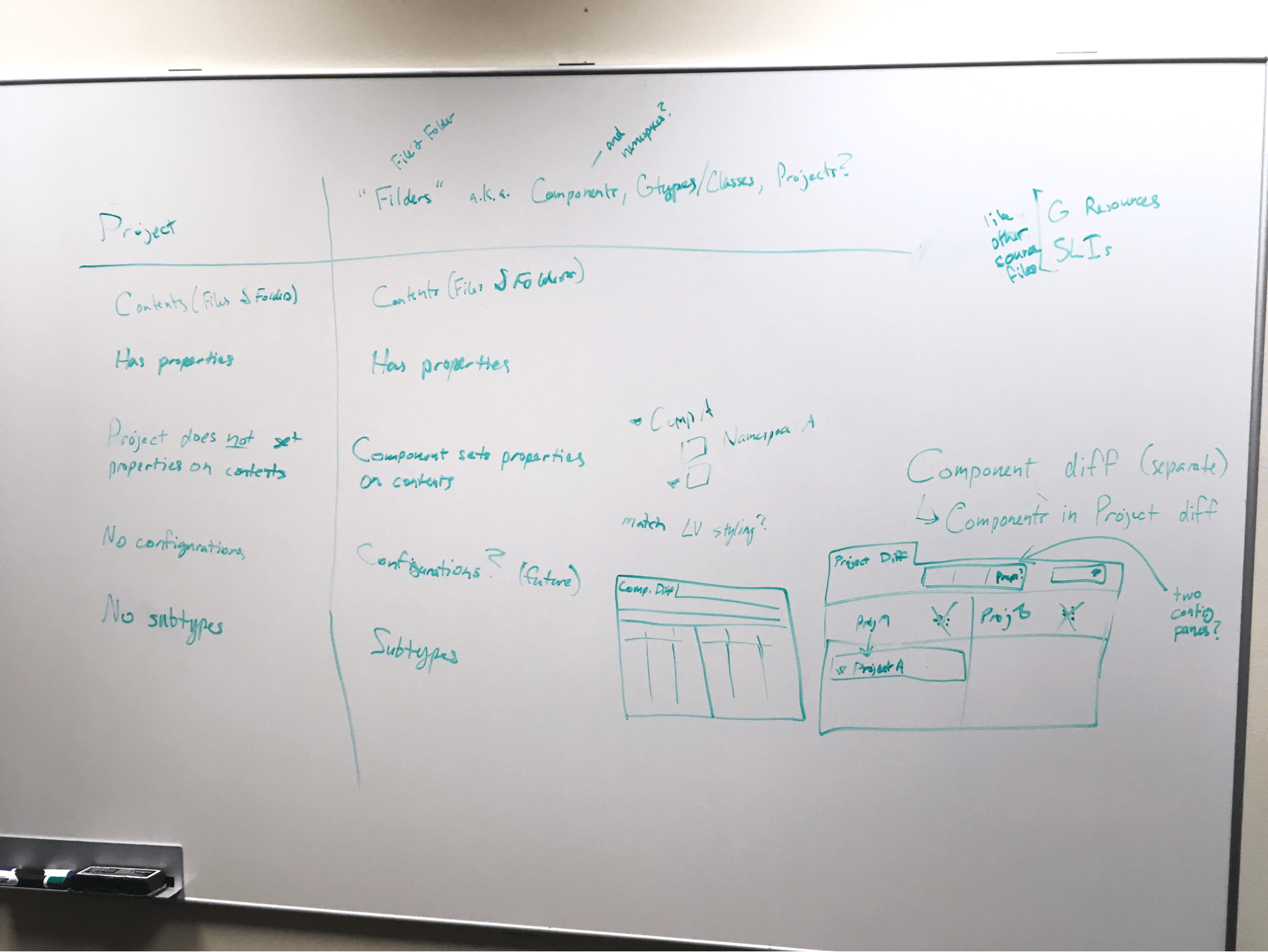
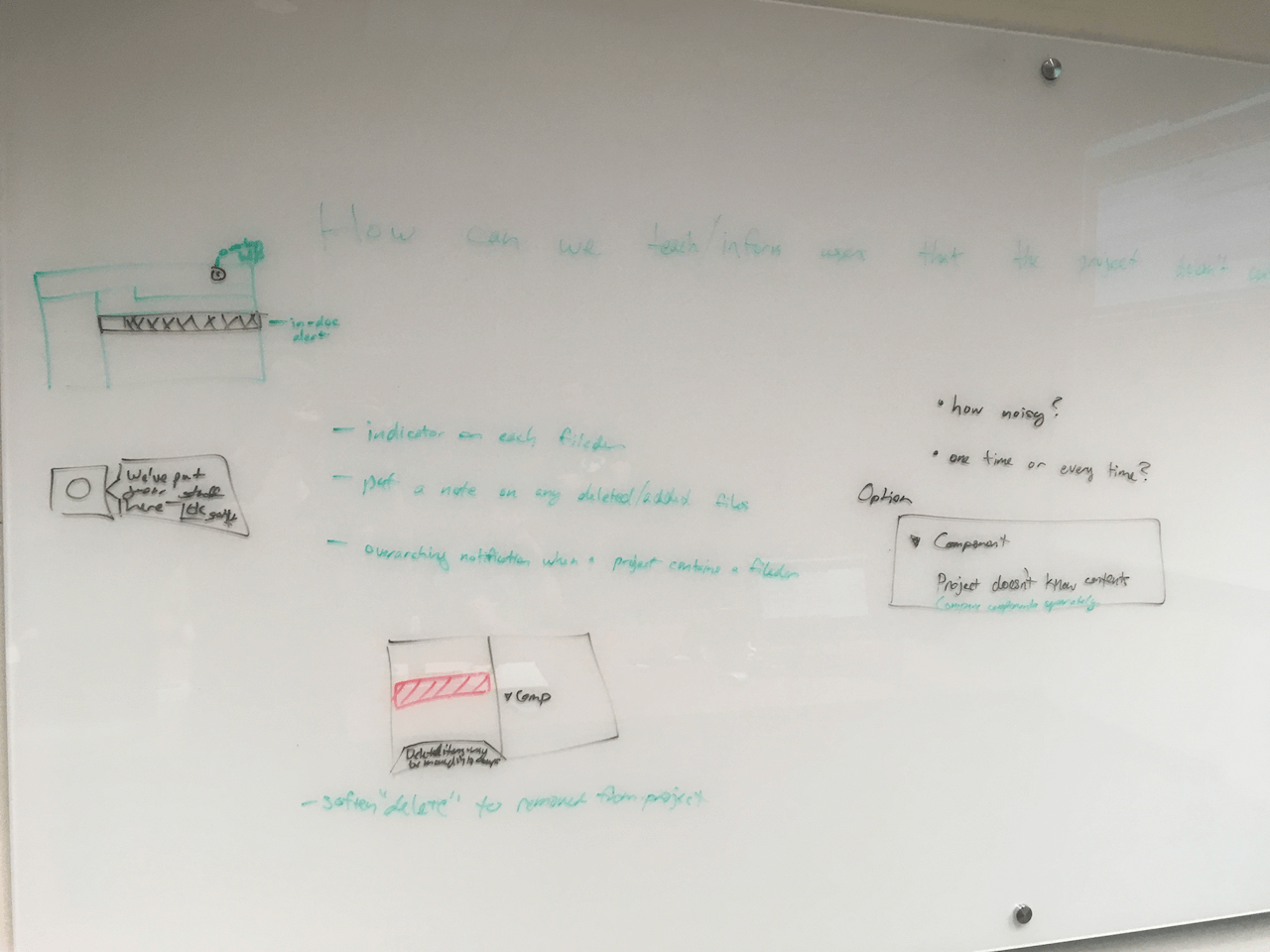
“fileders”
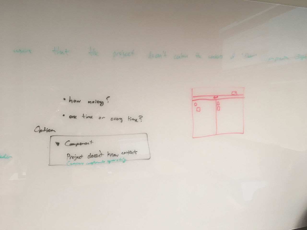
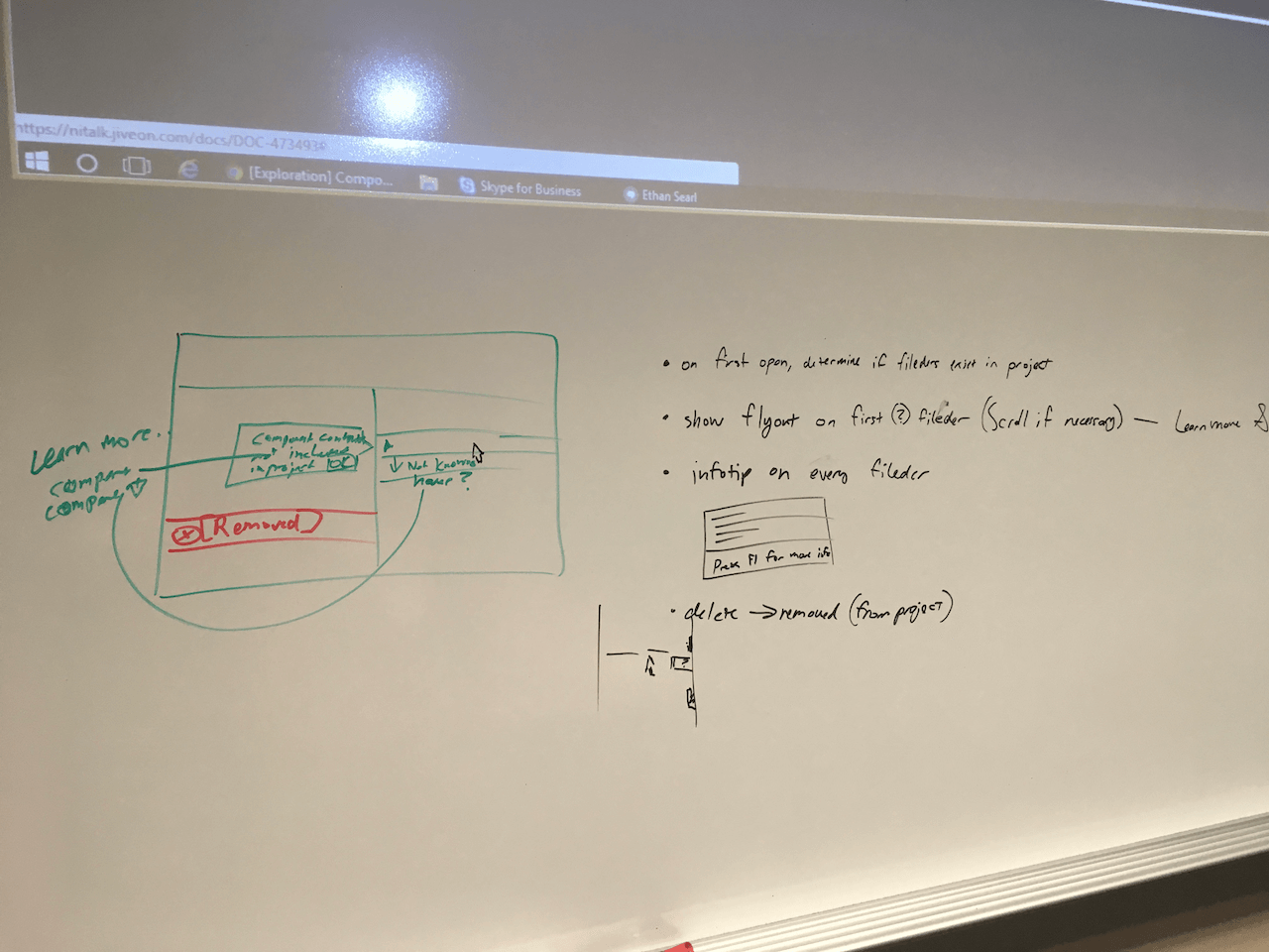
projects also contained a special type of file/folder. these were dubbed “fileders” by the design team. handling these prompted another round of the lean ux process.
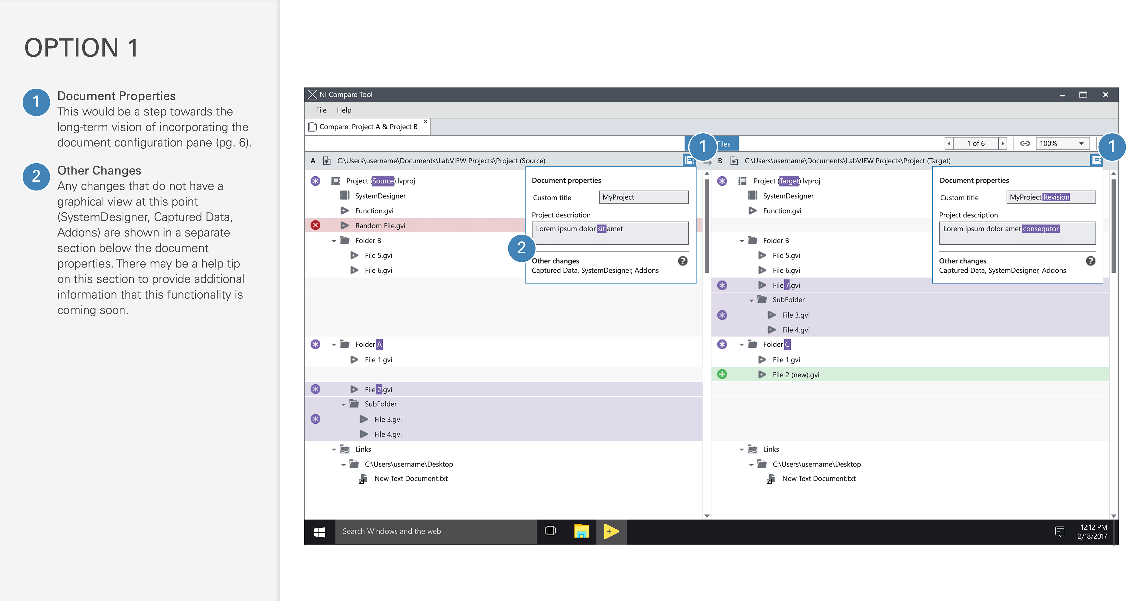
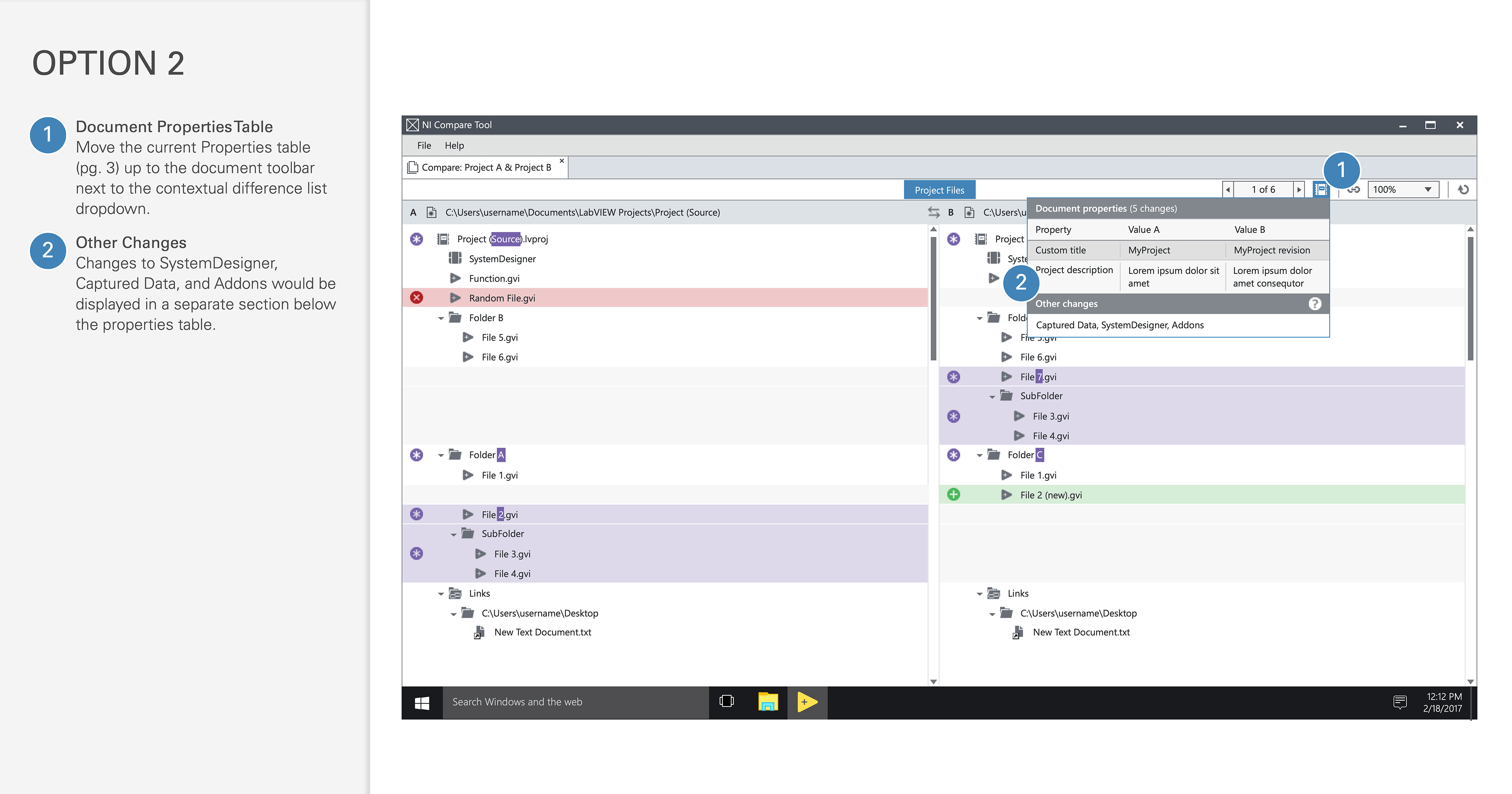
project document properties
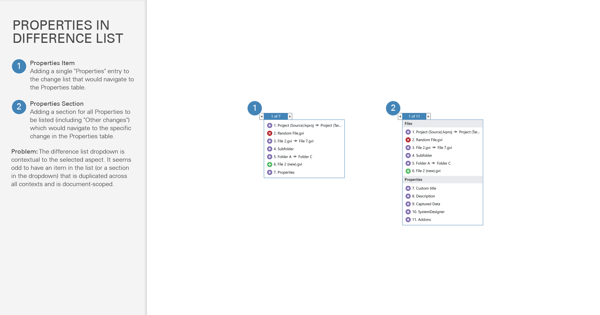
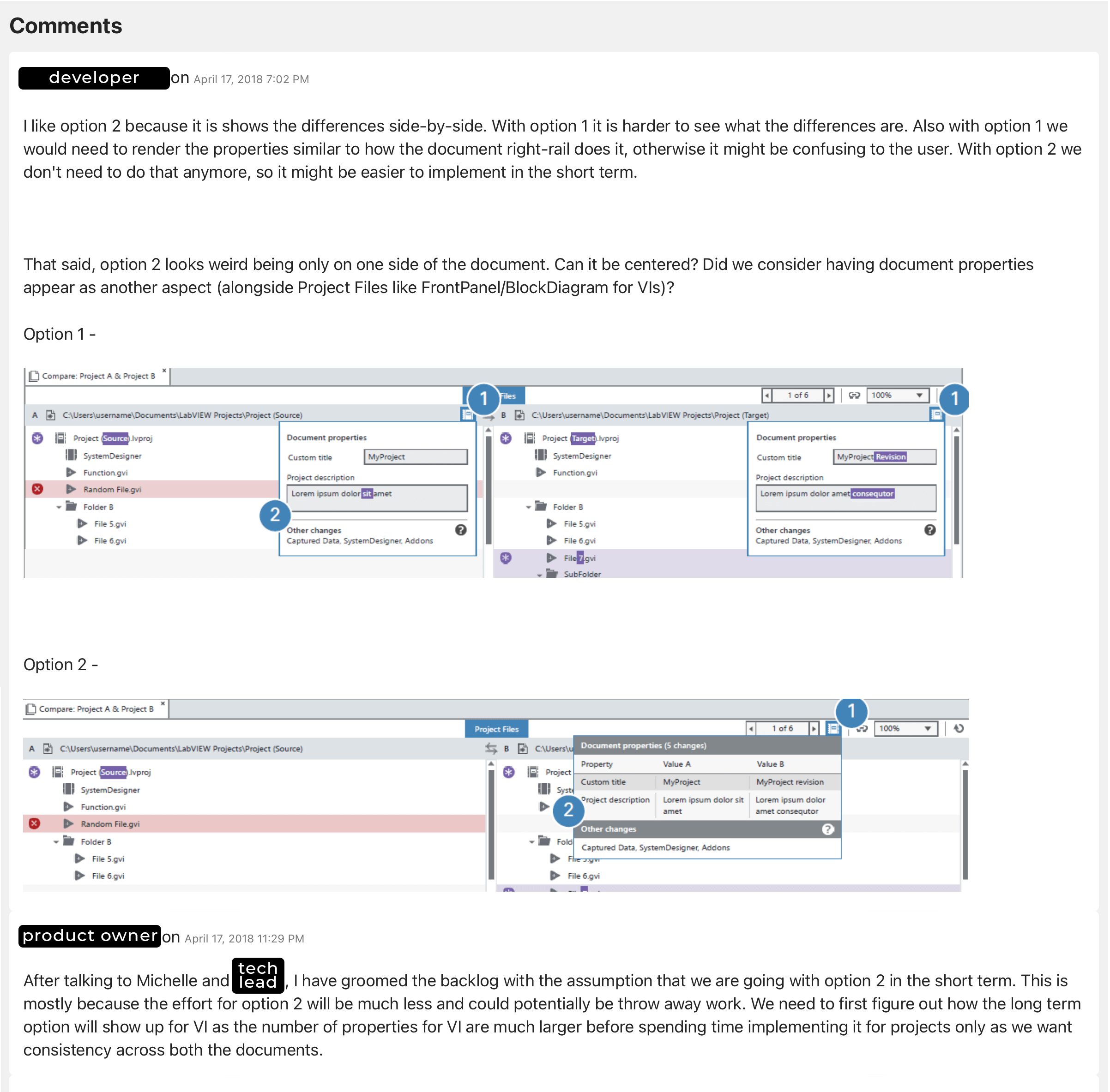
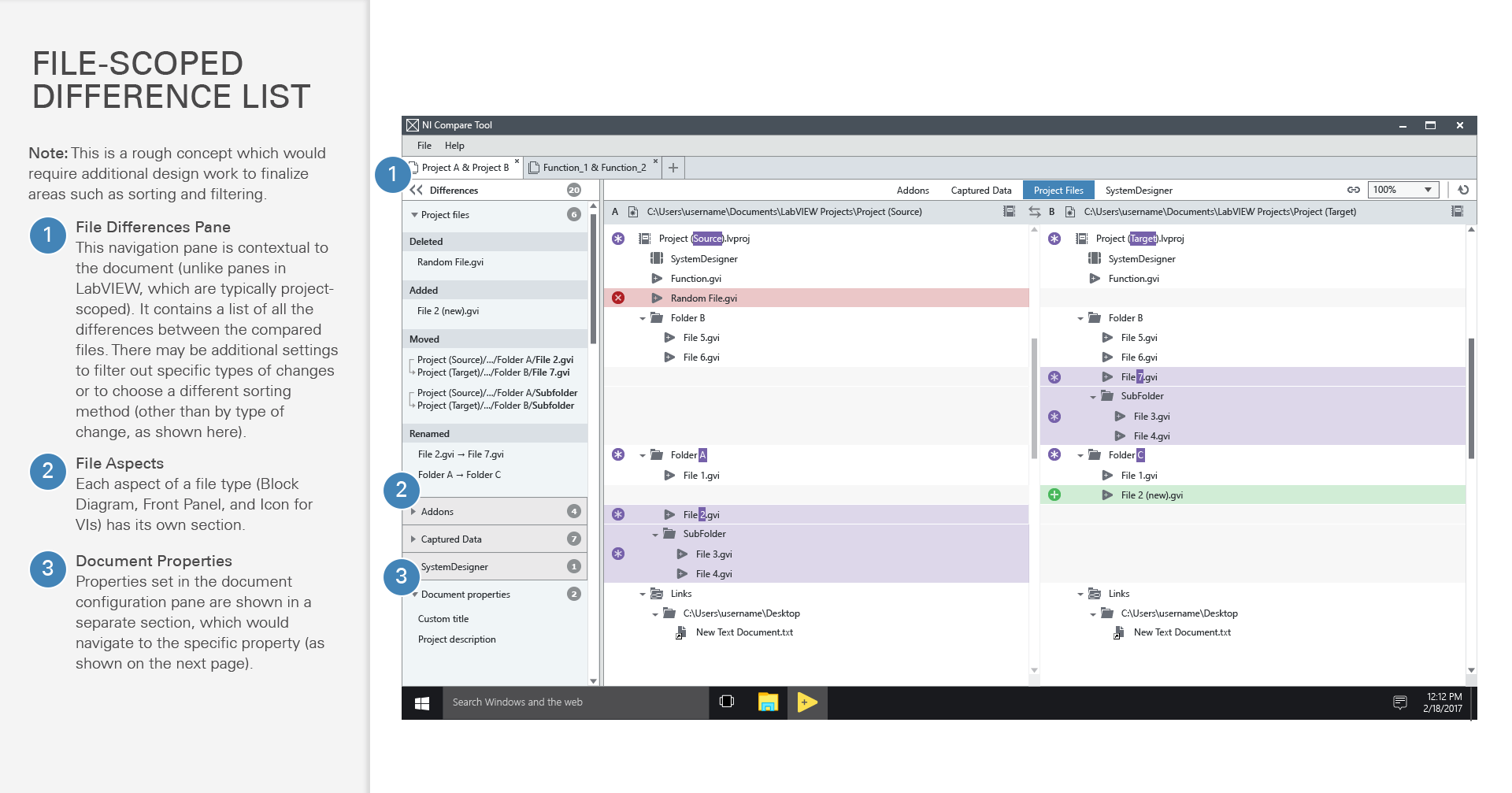
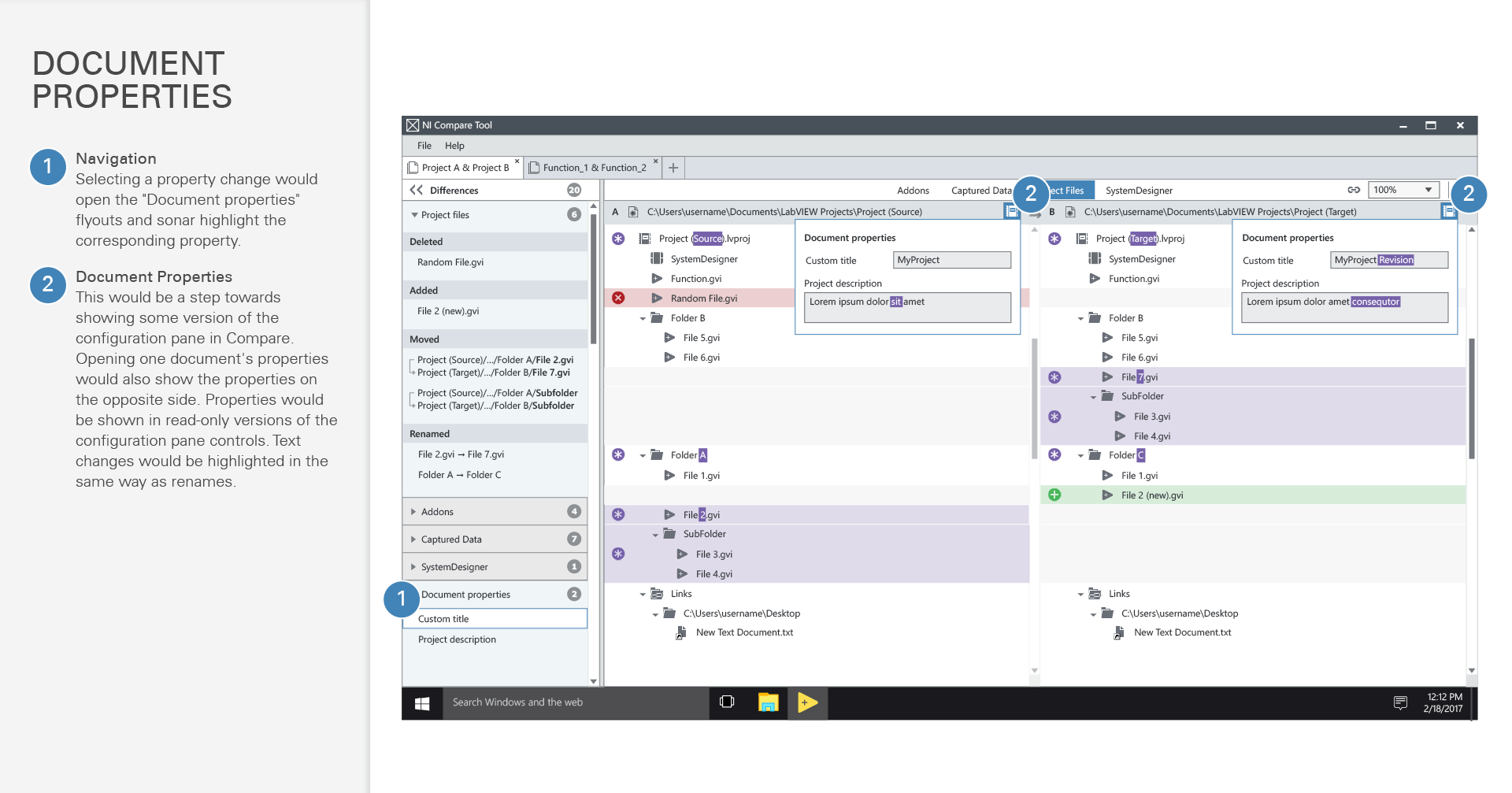
lastly, we needed a way to display the property configuration changes between projects. in this case, i explored a few short-term options and discussed them with the team.
due to technical and timeline constraints, we weren't able to use the existing presentation of these properties. i created a lightweight spec for a more ideal solution to revisit in the future.
final product
sharing our experience
experimenting with lean ux showed this process had potential for other teams. i ran a designer-centric book club. the tech lead and i gave a presentation at our internal tech conference to an audience of developers, designers, product owners, leadership, and other roles. our talk generated a lot of interest, questions, conversation, and several follow-ups.
closing thoughts
lean ux isn't a silver bullet, and it isn't right for every project. it's great for small, well-defined problems where design and agile development are happening simultaneously.
things i'd change
there wasn't as much testing with external users as i and the team would have liked. that being said, the product owner and i made good use of forums and internal users to evaluate design decisions.
next steps
comparison was only the first step. a robust development environment also needs to allow users to determine which changes to keep, and “merge” edits made by multiple people. due to shifting business priorities after this project, the development team's focus shifted, and i moved onto another product entirely.


![a screenshot of a post on the intranet site. there are two design mockups, and the following text: [Exploration] Components and Other Fileders in Project Compare. (Fileder = File + Folder). Ideally, we should be showing users what they are familiar with from the Files Pane (which would involve loading Component/G Type/etc. contents whenever possible). This would result in something like the following when files have been moved into an Application component: mockup. If on the way to this we need to stage in a warning/notification to the user that components etc. aren't supported in Project Compare, here are a few early explorations (message wording TBD): help tip on the component mockup](assets_visualdiff/filedernitalk.png)
