running short on time? check out this overview video—it's under 2 minutes ☝️
user goal: share a code library or application created in labview nxg (or install it on test machines).
the problem: sharing and publishing content in labview nxg pre-2018 was confusing and error prone.
the team:
me (interaction designer)
visual designer
ux researcher
technical writer (documentation)
product owner
marketing feature owner
technical lead
developers (5)
discovery
user research
i started by interviewing internal stakeholders and subject matter experts, then had a few conversations with external power users to get their perspective. these conversations were helpful to get the perspective of advanced users.
the most impactful insights for our broader customer base came from a series of customer visits that i conducted with my product owner. seeing the context where some users worked (like a basement office) and hearing how they shared files (e.g., on a usb stick carried by hand between offices) led to the goal of a simpler and more linear flow for the primary use cases.
technical constraints
labview nxg libraries and applications are distributed and installed using a package manager. creating packages with all the needed information is a bit more complex than just sharing the files.

there were also several constraints of the platform we were building on (while it is software, and as one of my development partners used to say “anything is possible in software”, not everything was practical to build in a reasonable timeframe).
existing workflow
the first version of this workflow was designed without input with from the ux team. while it was technically functional, there were several usability issues:
- users had to manually switch to a second tab in the configuration pane to set required information. the configuration pane was not meant to be the primary point of interaction in a document—i should know, i designed it.
- users had to manually click a button (also in the configuration pane) to make sure that the package contained everything needed to run properly. guess how many people either didn't know they had to do this or forgot to do it.
- there was no indicator on required fields, not even an asterisk in the label. in order to learn that a field was required, users had to start the build process (which was not speedy), wait for it to fail, read in the error message what required information was missing, then go find the field to enter that information. oh, and the error message didn't always list everything that was required, so users often had to go through this process multiple times.
tl;dr: the process was nonlinear and highly manual, and it didn't help the user succeed.

competitive analysis
outside of command line tools, there are only a few applications for creating packages, one of which is was from adobe. while i didn't love their use of a wizard pattern, i did appreciate the clear way they grouped required inputs and settings. other places i took inspiration from included xcode, visual studio (and vs code), mac app packaging, and google photos.
exploration
design brief
i ensured stakeholders were aligned by capturing learnings and high-level goals in a design brief:
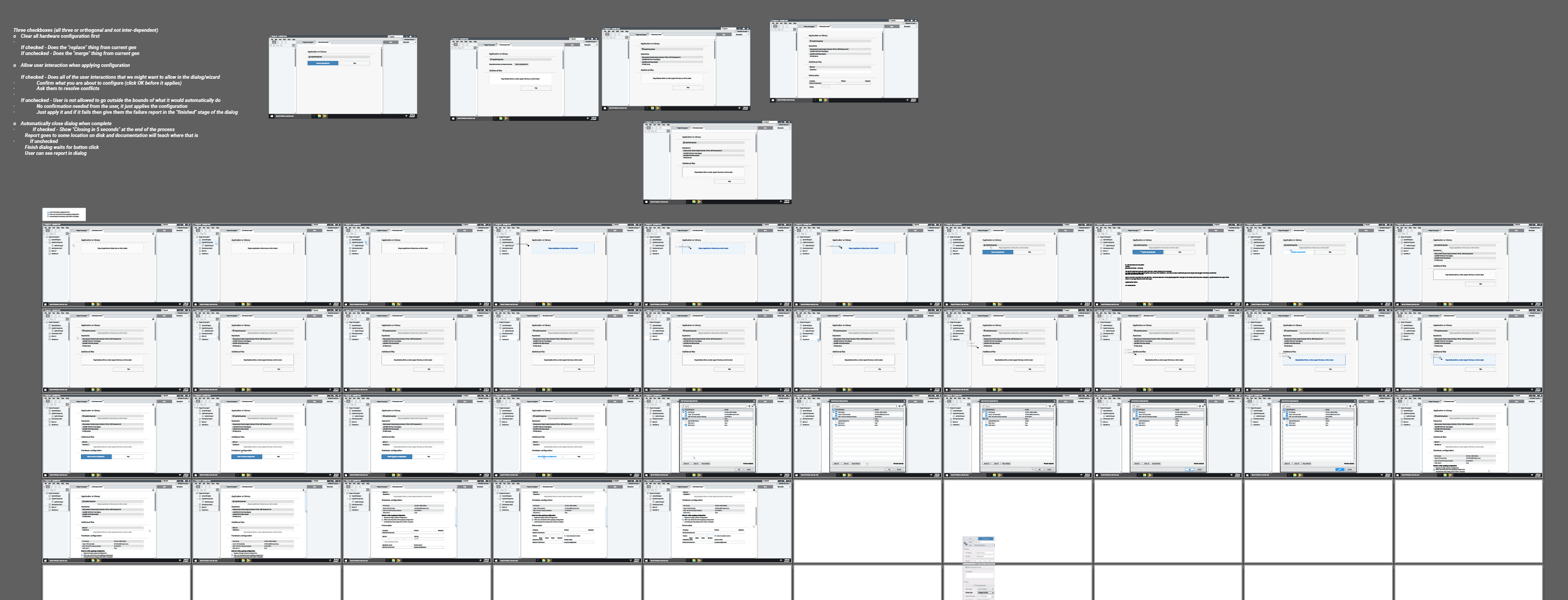
sketching
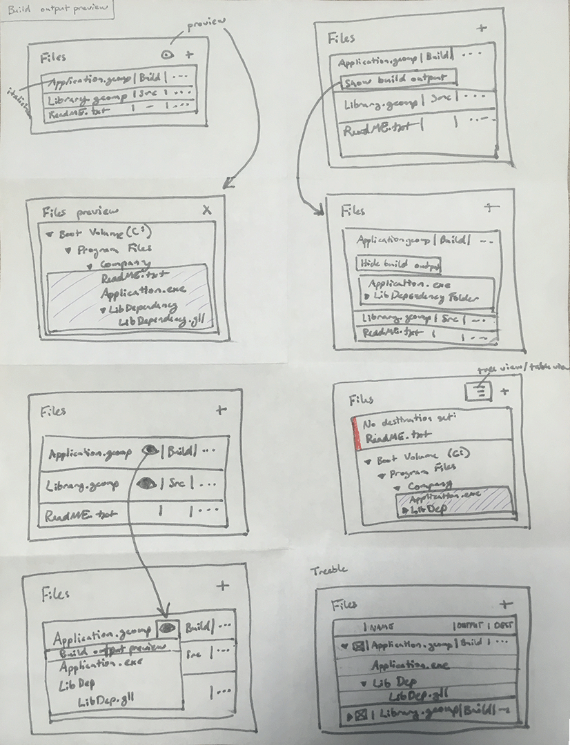
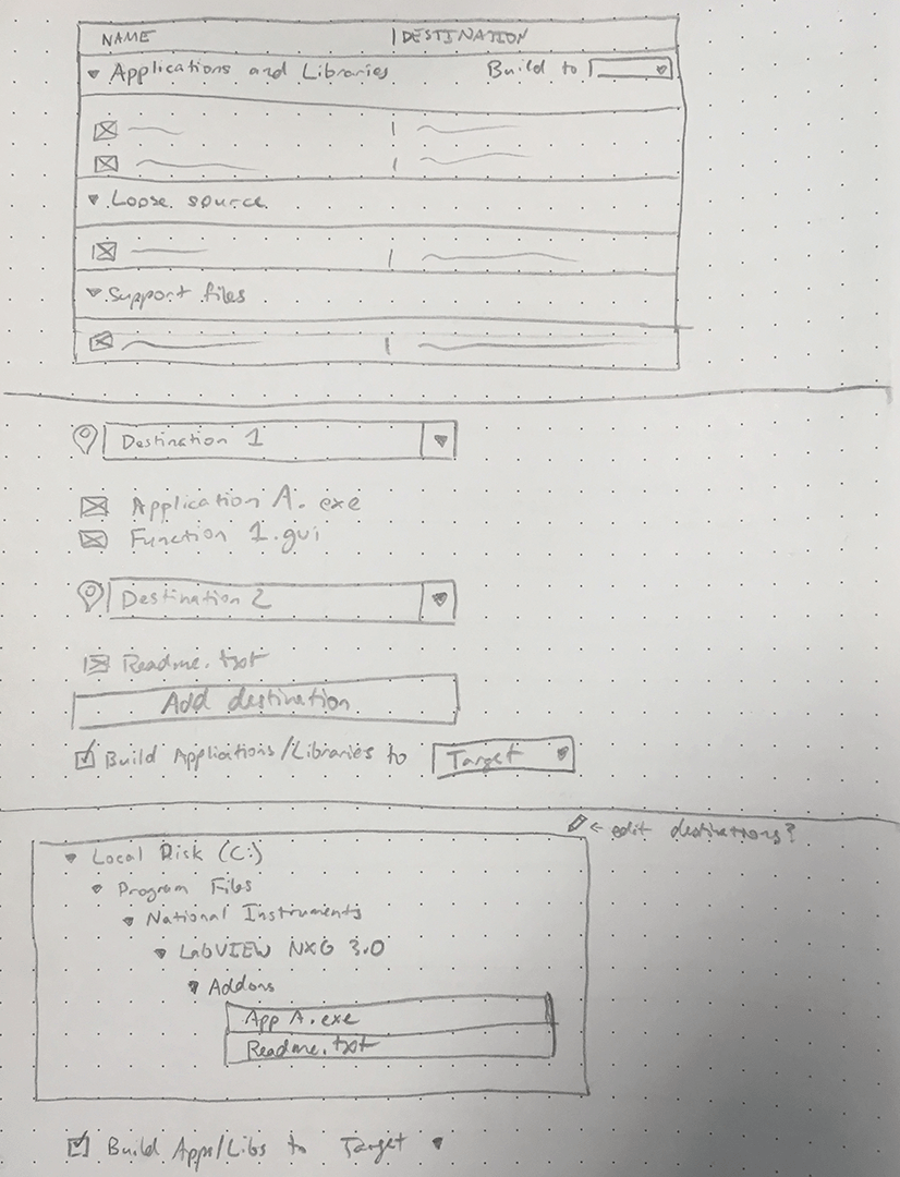
while i wasn't able to find my sketchbook from 2018 (and i don't have the same digital trail of everything from then as i do in our current virtual work environment), you can imagine several explorations similar to these from related projects:
early ideas included everything from a wizard (one of my least favorite ui patterns) to a single-click publish button (not feasible due to aforementioned technical constraints).
collaboration
i enlisted the help of a colleague to do some brainstorming and asynchronous collaboration, since his work in hardware dependencies overlapped with mine (and two designer brains are always better than one).
low-fidelity wireframes
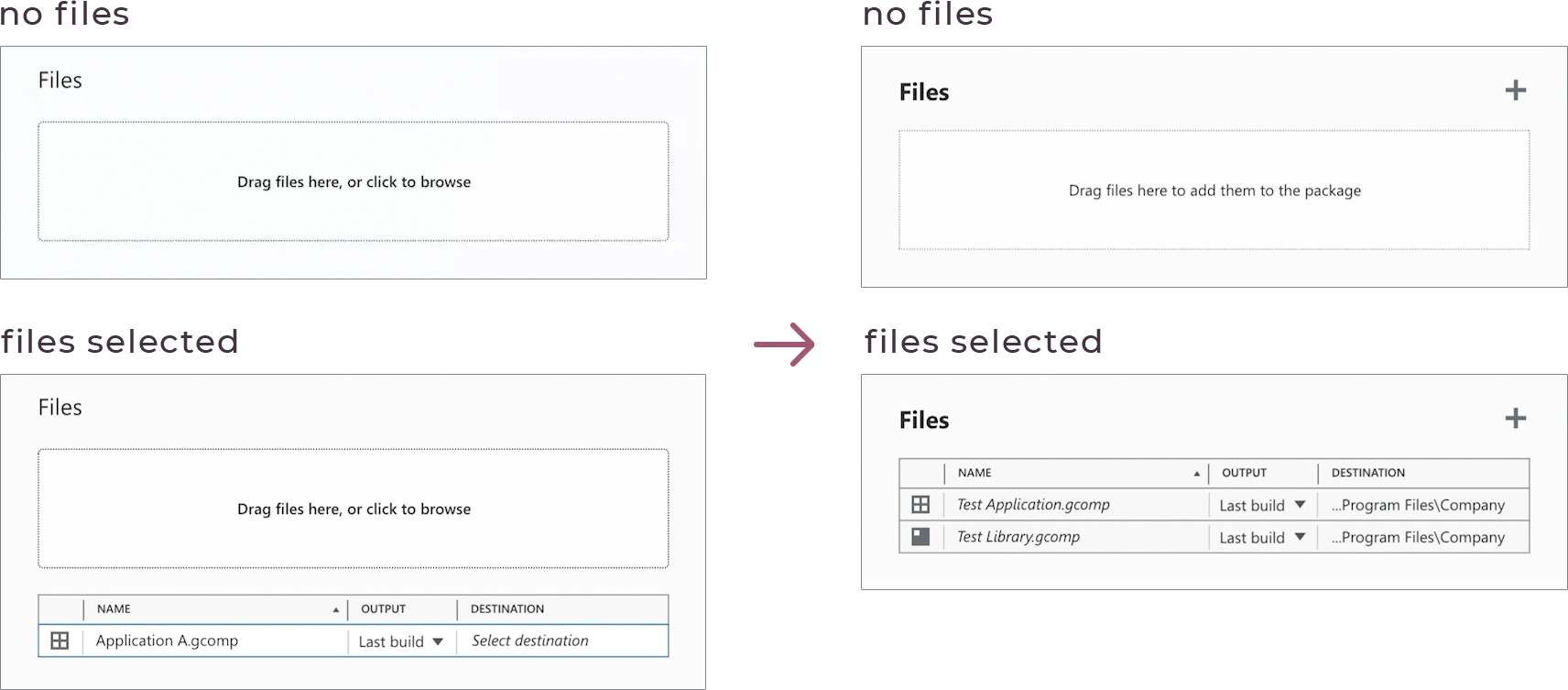
i mixed and matched ideas from across these early explorations to land on an initial idea to test: a single-page (scrolling) document with a top-down linear flow of information and interactions.
testing & iteration
first prototype & usability testing
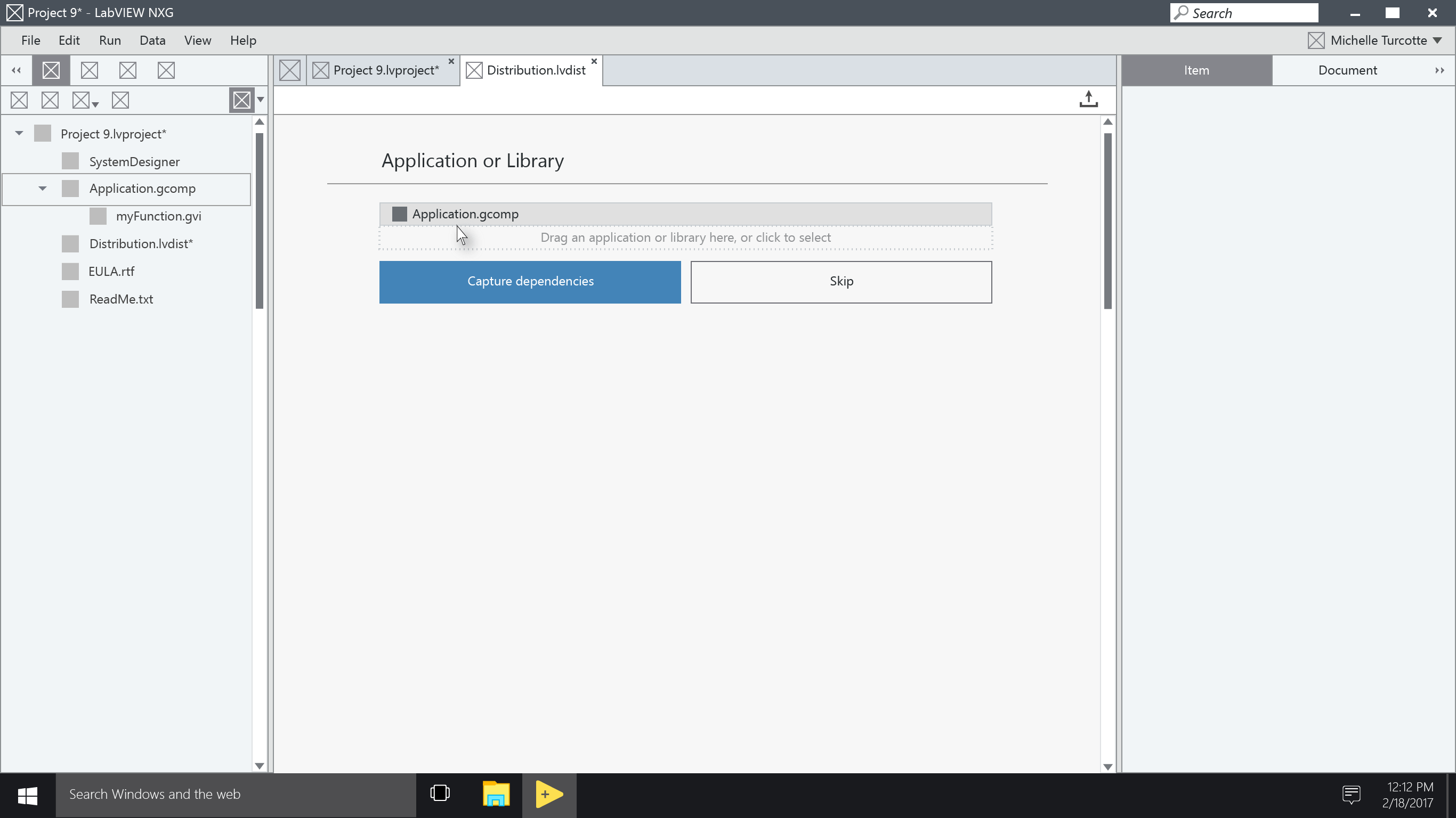
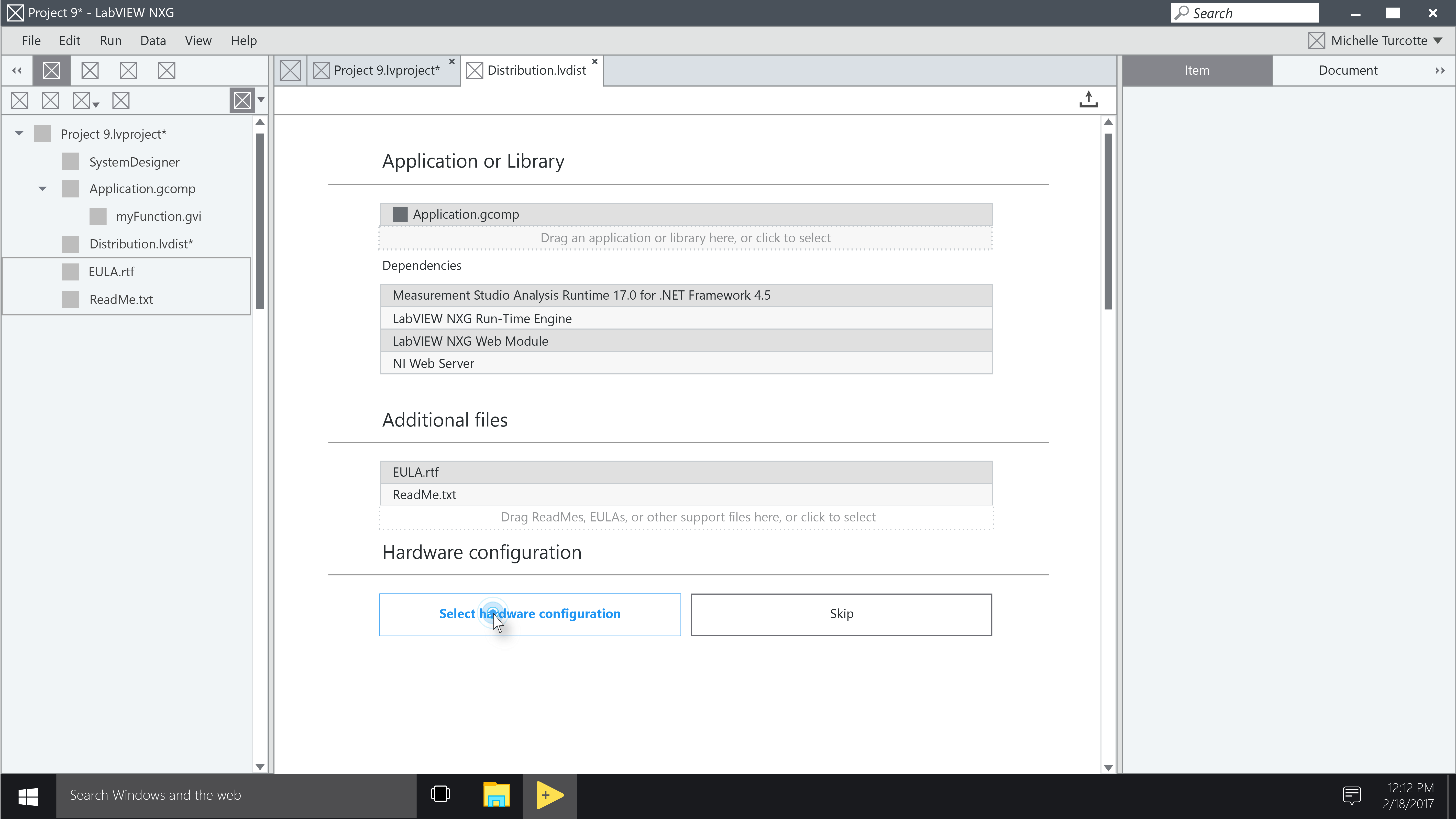
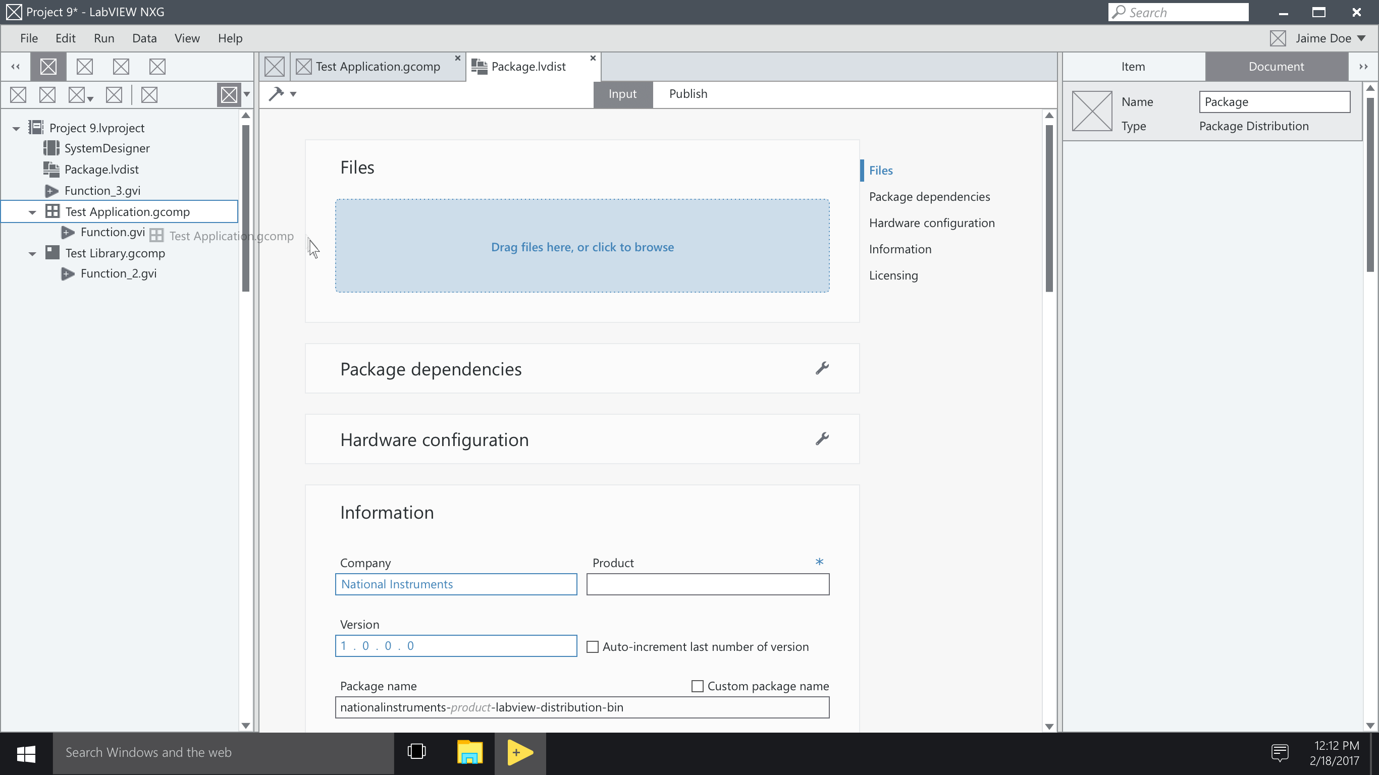
i created this prototype in framer (the original version, later known as framer classic):
i worked with one of our talented ux researchers to define the goals and test plan for this initial round of usability testing.
from this first round, we learned:
- the top-down linear flow worked well for participants (yay!)
- renaming "distribution" to "package/installer" matched participants' mental model and improved discoverability
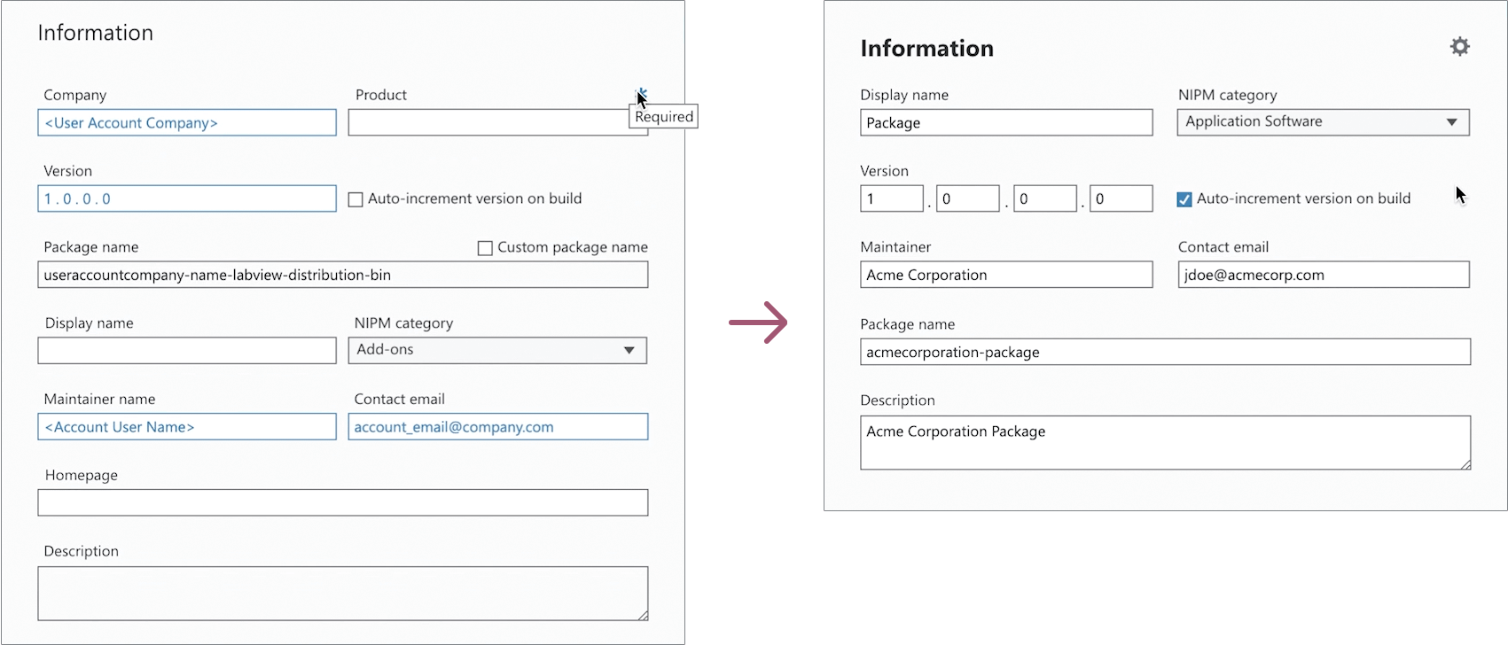
- auto-filling information fields was a delighter
- the separate "publish" tab was either confusing or not discoverable for participants
- keeping the file drop section after a file was added distracted from the list of files below
- the interaction i kind of loved for marking required fields was a complete failure (i like when that happens—it means i'm pushing the envelope)
- and more!
iteration
there were several changes, large and small, that i made to the design based on those learnings, but here are a few key iterations:
-
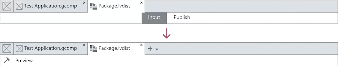
removed the "publish" tab, returned the "build" button to the toolbar, and added access to an output preview
-
replaced the file drop section with the file table after a file was added (while maintaining the drag/drop functionality)
-
experimented with only having required fields in the information section (removing the need to differentiate them), with the idea that optional fields could be progressively disclosed elsewhere
in addition, i collaborated with one of our visual designers to improve the layout and typography.
second prototype & more usability testing
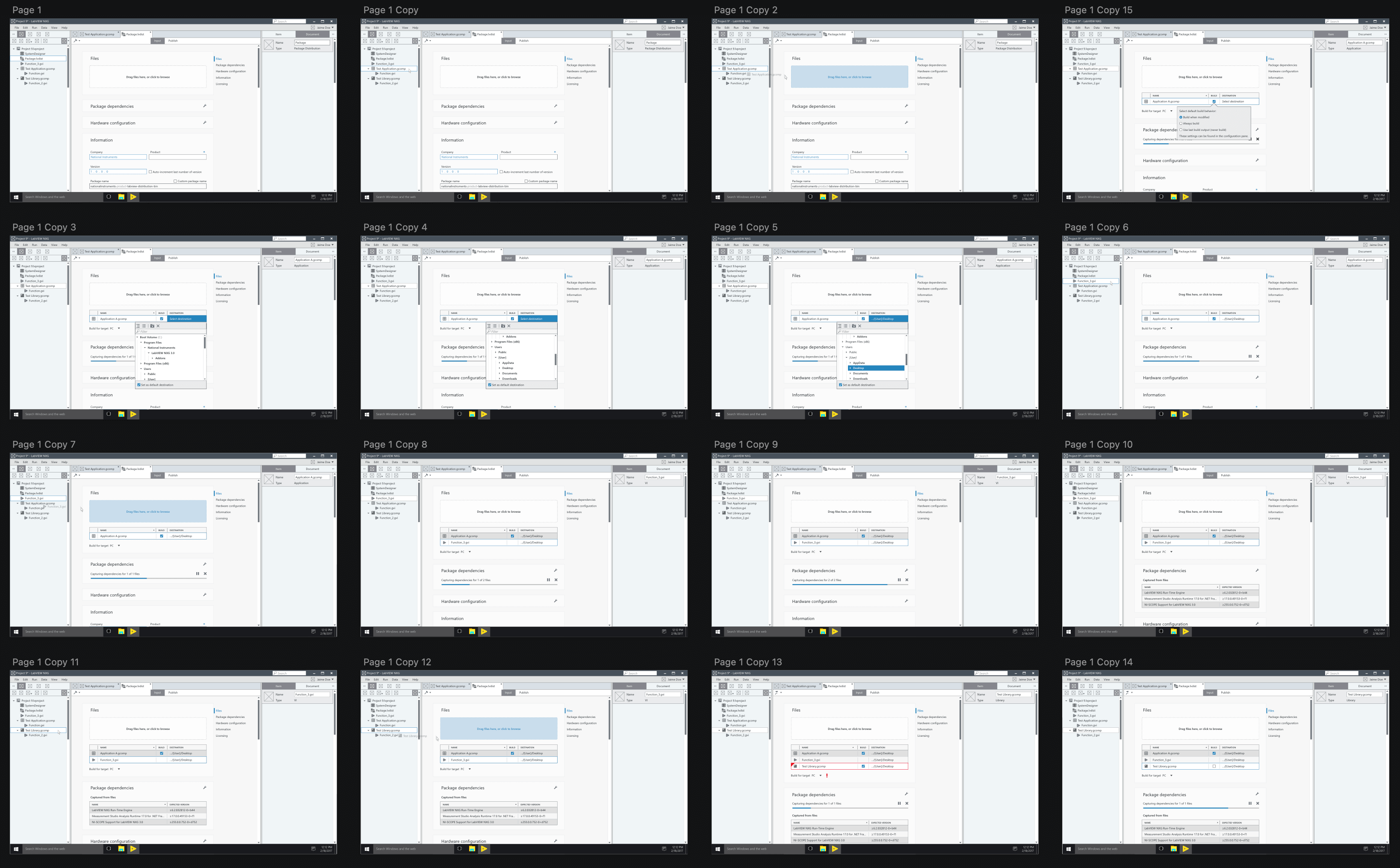
with the design iterations, i updated the prototype to make it more robust:
nerdy aside on prototyping tools: i miss the original framer (a.k.a. framer classic). sure, the learning curve was pretty steep, but it was incredibly powerful for advanced prototyping. i mean look at these prototypes—they had it all! tooltips, right click menus, multiple logic paths, interactive text fields with form validation!! figma's great and all, but it's no framer.
once again working with a ux researcher to conduct usability testing (this time remotely, which way less common for us at the time), from this second round we learned:
- the overall flow was clear and well-received by participants
- there was some confusion around the more technical terms like "feed management"
- the click-away behavior of the destination selection flyout/popover was unexpected (participants wanted it to behave more like a dropdown and close on selection)
armed with these learnings, i began refining the design and getting it ready for implementation.
implementation
design specs
after refining the design and working through the edge cases, i put together a design spec for development:
collaboration with developers
of course, i don't just throw a spec over the wall to development. my involvement continued through implementation: answering questions as they inevitably arose, making minor refinements to the design as new technical constraints and edge cases were discovered, and identifying staging opportunities to meet tight deadlines.
final product
in spite of tight deadlines and shifting priorities, the development team was able to implement the majority of the workflow as designed:
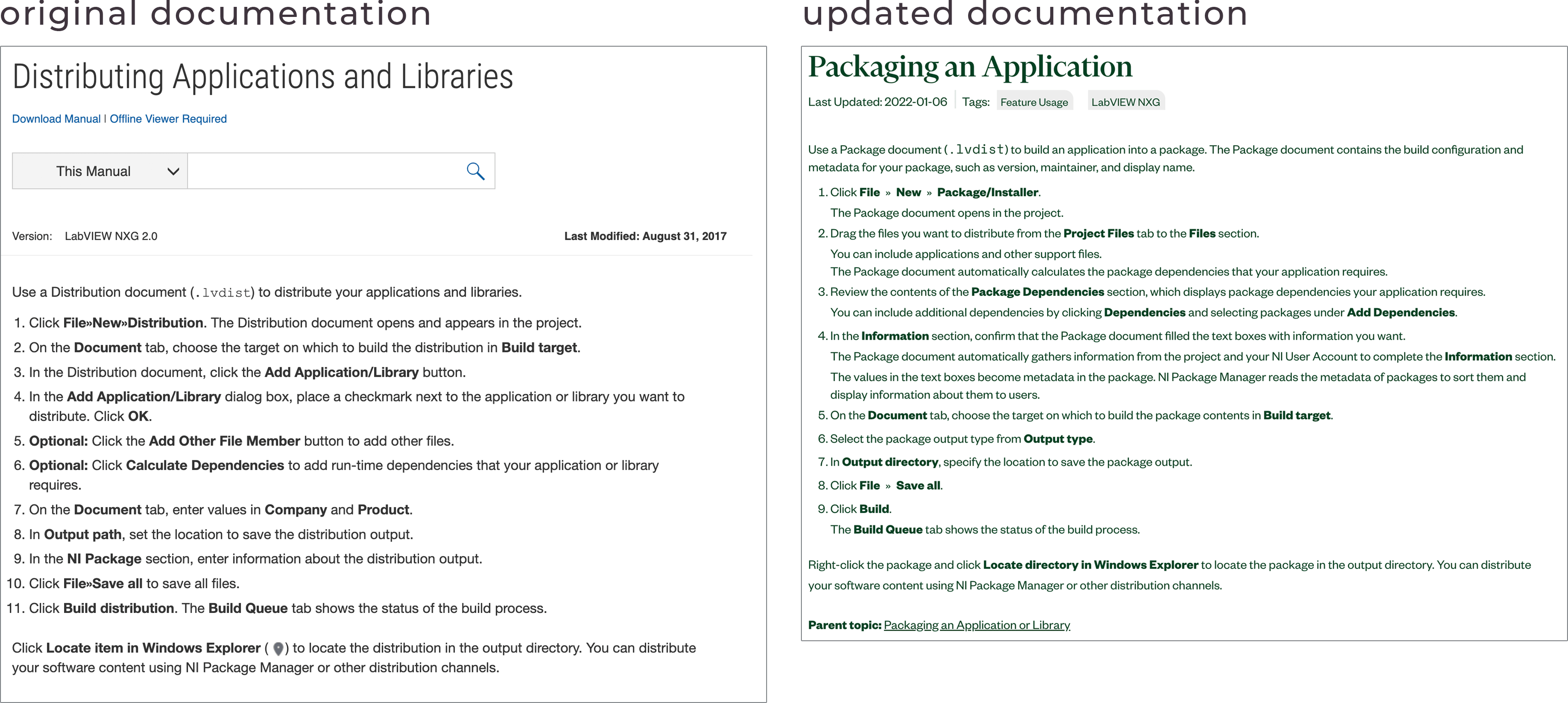
for comparison, here are the original documentation instructions and the new instructions, complete with two fewer steps (notice how many things happen automatically now):
closing thoughts
there are a few things i would want to change (for example, getting the build target field into the main document space, as well as time to work towards more visual polish in the final product), but overall i'm pleased with the design direction and what the team was able to accomplish.
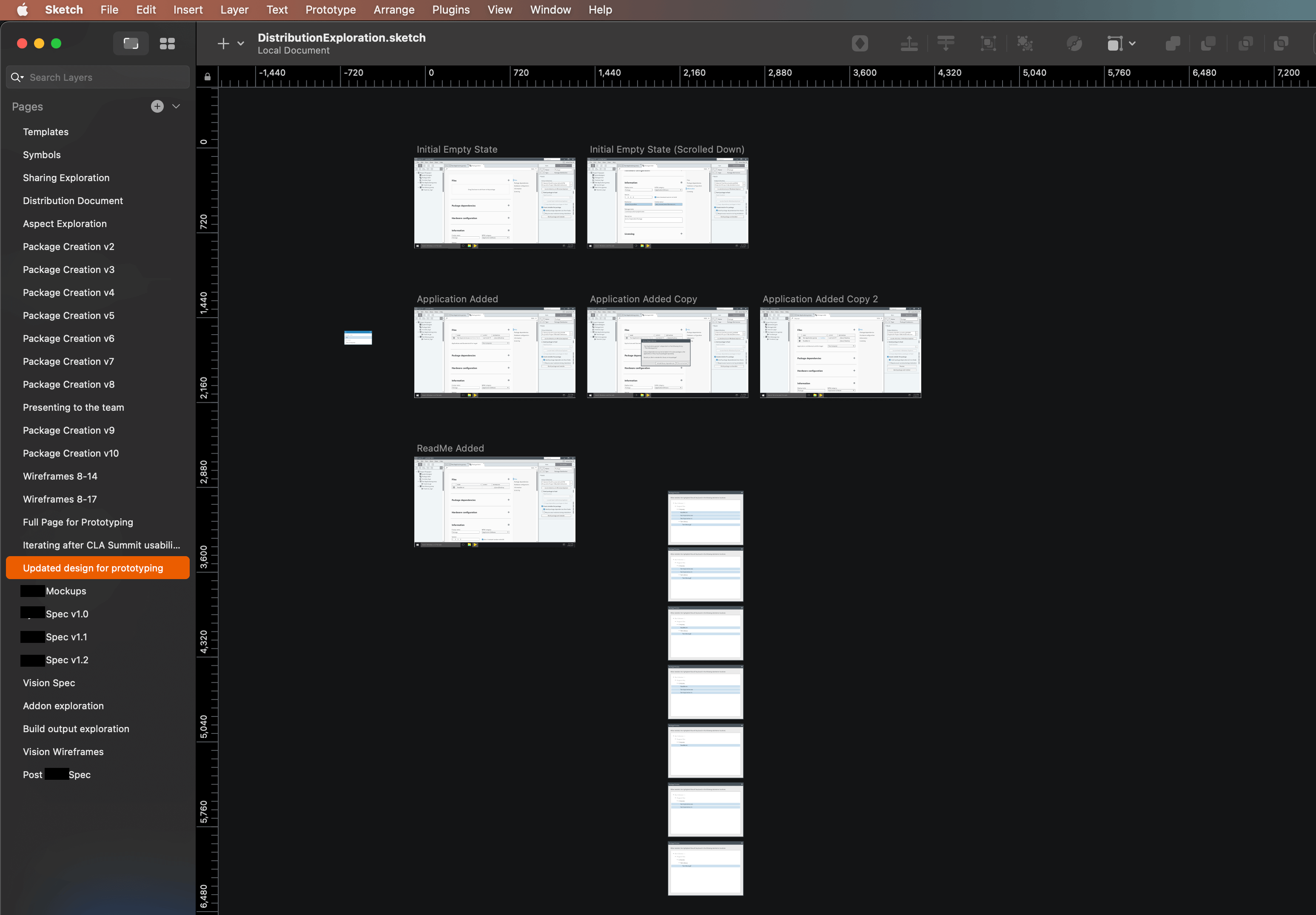
if you've made it all the way through this case study—congrats! it ended up longer than i was hoping, but much like a prototype, i left out a lot in favor of going through the “happy path”. the much longer story is evident in the number of pages in my final sketch document: